Your Homepage Is Not a Landing Page (and It's Costing You Money)
Your homepage tries to do everything: introduce, convince and sell at the same time. That strategic mistake is exactly what's costing your business conversions.

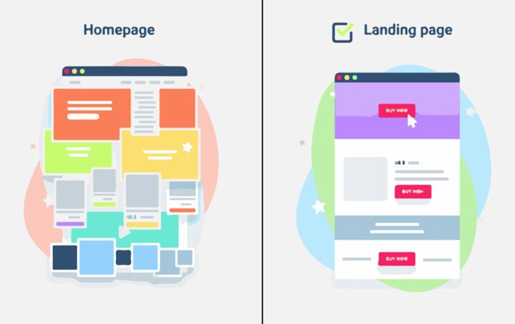
If you're putting money into Facebook Ads or Google Ads and the ad link goes straight to www.your-company.com, you're burning budget in real time.
It sounds harsh, but it's reality. I see this mistake every day: founders or marketing teams who set up incredible campaigns, get a rock-bottom CPC, ads with a brutal CTR... and when the user clicks, they land on the company's Home page. Fifteen seconds later, the user is gone without buying or leaving a single piece of data.
The problem with your main page
A corporate Home page is designed to inform. It has a top menu with five options ("About Us", "Services", "Blog", "Contact"), social media buttons in the footer, a slider with three different messages and maybe a corporate video.
It's an amusement park. And you don't want users to have fun browsing, you want them to convert.
Every hyperlink you put in front of a user is an invitation to leak out of your sales funnel.
When someone clicks an ad that promises "Speed up your PC", and on landing the first thing they see is the mission and vision of your tech company, their brain says: "This isn't what I was promised". And they hit the 'Back' button.
Enter the Landing Page
A landing page has a single objective: conversion. No navigation menus, no external links, no distractions. Either the user takes the action you want (buy, book a call, download a PDF), or they leave.
This is where the key concept comes in: Message Match (Message Match).
What is Message Match?
It's total synchronization between your ad and your landing page. If your Meta ad says "Half-Price Excel Templates for Accountants", your landing page headline (H1) should say "Excel Templates for Accountants - 50% Off Today".
- The same language.
- The same offer.
- The same visual identity.
Zero cognitive friction for the user. You're telling them unconsciously: "You've come to the right place, here's what I promised you".
The anatomy of a landing page that bills
If you look at the landing pages of the startups and e-commerce brands scaling the most today, they share a similar structure, focused on removing doubt and guiding action:
- A clear headline (H1), not a clever one: "We help B achieve C" works better than a poetic phrase about the future of the industry.
- A powerful above the fold: Title, short subtitle and the main Call to Action (CTA) button should be visible without scrolling. Especially on mobile.
- Real social proof: Testimonials with photos, customer reviews, logos of companies you work with. People buy what others have already bought and validated.
- Zero friction: Ridiculously short forms. If you only need the email and name to book a demo, don't ask for their national ID number or postal code.
- Aggressive load speed: On mobile, if your page takes more than 3 seconds to show, you've lost half the curious.
Designing for conversion doesn't mean making ugly pages, but it does mean taking the ego out of design. Stop thinking about what looks "pretty" and start measuring which element pushes the user to the next step.
Sending paid traffic to a Home page is like sending people to a shopping mall and hoping they buy at your store specifically. Sending traffic to a landing page is sitting them in the closing room and telling them exactly why they need to buy from you now.
Let's talk about how to apply this to your business.